This post comes a little late to advise you on any chess-art at this year's Royal Academy Summer Exhibition, as it is now closed. Not to worry. There wasn't any...
 |
| On not finding any chess at the RA. But maybe she'll get a nice surprise for her birthday! (Silent Howler Laura Ford, in the 2016 Summer Exhibition) [All photos by MS unless stated otherwise] |
Instead, get over it at Tate Modern...
...where you may encounter Germaine Richier's magnificent chess-set-with-attitude - displayed so it eye-balls you at close quarters.
 |
| L'Échiquier (Grand) (1959). Germaine Richier (1902-1959). Currently on show at the Tate Gallery |
"...the Fou (bishop)...hunch-backed he/it has just hobbled over from Notre Dame; then comes our Dame herself, in gaudy finery and equine haughtiness, brandishing her regal appendages with little decorum and some menace; the Tour (rook) bears a Gaudi carapace scuttling on a tripod undercarriage; the bronze Chevalier hints at a demented ostrich mean enough to peck out your eyes; and finally behold Le Roi! Calliper-fisted (mimicking the Queen's armoury) he threatens to separate you from the rest of your tender parts.
They are not happy bunnies, and they are more, much more, than impish hobgoblins. They are part of a tradition that manipulates the simple innocence of toys and playthings as a mask for the sinister and malevolent. They come from a bestiary of the grotesque and evoke feelings of unease as with all things misshapen and malformed. Play with these pieces at your peril..."
So, on that reading, they are chess pieces making mischief and dispensing misanthropy. Like your opponent at the board, they are out to get you, to have you for breakfast, to take you apart - from the inside out. They are, so I thought then, the chess equivalent of the Alien.
Now that I've seen them at the Tate again close up and personal - you can get within spitting distance of these charmers (be prepared to duck) - I think that, although hopefully a little bit right seven years ago, I was also indisputably quite a bit wrong. The further ruminations below have been prompted by the Tate's didactic caption The Disappearing Figure: Art after Catastrophe. So, I've now got a different take on them; and so, with your agreement, we'll forget all that earlier stuff and try again.
These chess pieces are, I'm now thinking, not simply malevolent do-no-gooders, the Lords of Misrule gone to the bad. They are, just as much, victims. They are the defeated. Suspicious and mistrustful, they display their wounds and ravaged innards for all to see. With gestures of empty bravado and resentful defiance they brandish their appendages. They are the ones - I can see it so much better now - who have been on the receiving end.
Germaine Richier created the Large Chess Set in the last years of her life which was cut short by cancer at 57. Her career was not without controversy when a Crucifixion commission for a church in eastern France was given a hostile reception by the Catholic hierarchy and, in 1951, it had to be removed from view. Otherwise she was friendly with Giacometti and the post-war European avant-garde, sharing their anxiety-imbued representations of the human figure, but ploughing her own furrow with her hybrid humanoid-animals.
She had created an undecorated version of the chess set earlier in the 50s (you can see one of the edition of 11 outside in the Tuileries Garden in Paris)
The polychrome additions came with a late flowering of colour in her work. The Tate's painted L'Échiquier (Grand) is the only edition that she made, and it is good to see in on display again after its last outing at the opening of Tate Modern in 2000. I think that it works well indoors: it thrives in a closeted conspiritorial atmosphere.
Why did Richier chose chess pieces for her last work? The commentaries on her - those that I have read anyway - don't offer an explanation. So I'll try one. Chess pieces, transitional from one order to another, lend themselves to her category-bending impulse; they are inherently ambiguous: referring back to the human, and on into a game (and, even better: the knight and rook have animal overtones).
And a chess set? Perhaps we can fruitfully compare and contrast hers with that of another artist, someone we examined last year, and who also choose this subject (but straight and without grotesquery): Anwar Jalal Schemza. (As of the date of this post, his chess paintings are still on display at Tate Britain.)
For him, the collectivity of the chess set was a stand-in for the family united in social stability - the unit whereby society renews itself and looks forward to the future. By contrast Richier's set - when taken ensemble - is a motley band dogged by its past and thrown together by happenstance. They hang out together for safety in numbers - an accommodation of tenuous convenience. They are all faced-forward, bound, faute de mieux, by self-interested common purpose. But the ties that bind are loose, and will survive only so long as it suits. In company like this each had better watch its back. What Schemza and Richier both allude to are the modalities of group adhesion - but from opposite poles. UniBond and Elastoplast.
And what about the decoration, the dimension added by Richier, discovered late in her life? The added colour works in different ways on the five pieces, and sometimes within the same one. If it's not too laborious, let's go through them. The simplest is the Knight.
Camera-phone and light direction have played tricks here because back and front are in fact the same: a base colour of untinted plaster and a deliberate red line, the use of which we are now analysing. That line is neither descriptive nor decorative - it is doing a job. On this emaciated thing (like a sea-horse according to Valérie Da Costa (2006)) the line doubles the contours, and with functional simplicity provides a kind of exoskeleton. Eaten up by its anguish the creature might otherwise crumple under its weight of angst. The colour runs down its spine and around the perforation, reinforcing what is but a waffle of a body. The beastie is shot-through with suspicion - it scans the horizon like a meerkat on speed. The King (further on below and left) also sports this line in armature - but in a right Royal Blue, fit for a monarch.
The colour on the caliper of His Majesty is of a different stripe: noir is not only the shade of his instrument but also his genre of Gothic. The black sits simply on the curve as a reminder of the steel from which the tool is fashioned. Here the colour is descriptive. Incidentally there is also a self-reference: Germain Richier was a practitioner of the measuring method in sculpture and she used such a device when scaling from the model. There's one on the wall of her studio, below - she is standing next to L'Eau of 1953/4.
The would-be sea-horse only sustains one hue: crimson. This colour of alarm is modulated to another shade in the irruption on the breast of the King. It suggests a flesh wound, perhaps something deeper, though I doubt he was really a bleeding-heart liberal all along.
Red also appears in what might be the blood-shot eye of the Queen (above right), or it might be a touch of rouge intended to flatter (though in this case, "mutton dressed as lamb" is hardly fair on mutton); or war paint perhaps. For a more telling diagnostic on the Her Majesty's disposition observe her nether regions - the chances of her reproducing the royal line are plainly shot to pieces (and her mammaries are obviously also hors de combat). Here carmine is both used as sanguine depiction and as bloody symbol. Incidentally, Da Costa says she has a tête de cheval, and the King is acéphale i.e headless (though no chicken, he) and who could disagree.
So it is possible that colour is used as decoration on the HRH's visage, as it is on the King's back, as well: where there's a big patch of gangrenous yellow/green - but the décor is much more elaborate on the florid flanks of the Bishop ('hunchback' as Da Costa describes him).
Da Costa is especially helpful here (assuming I've understood the French) in describing the evolution of colour in Richier's work: initially she added tints to the plaster, then experimented with collaged paper cut-outs in the manner of Matisse, finally - in the late 50s - adopting geometric shapes of paint after Marino Marini. Da Costa suggests that the colour on the fou bossu is also intended to evoke volume: blue for a depression in shadow, yellow for fullness in light. Anyway, it gives His Holiness a lurid coat of many colours, though the effect is comically undermined by his knobbly pins wedged into a satiric pair of cloven hooves. Of the five, this is the only creature filled with any solid corporeal substance, as quick review of the photos will confirm. The rest are eviscerated and hollowed-out. Richier seems to be saying that whatever the inflictions visited on others, the Church will remain in good fettle (and it will look after its own - after all, charity begins at home).
Finally there is the Rook, which appears to defeat even Valérie Da Costa. All she can say is that it is humanisée, which must be debatable whatever your point of view - and actually there are three to choose from.
The middle aspect (as I've arranged them) reveals its deliquescent innards: the other two show what might be protective plates on its flanks: both off-white and off-colour. But couldn't they be evil eyes on the elevations, which might make that proboscis some kind of prehensile organ of smell (God forbid it should be flaunting some kind of organ of reproduction). Are they antennae, periscopes or flagpoles up top - or is it a mad hair day? And Richier is having a laugh, isn't she, with those three legs: not so much humanoid as stooloid, good only for emergency evacuation, or milking cows. But I've got it now - those tentacular extensions to the top storey make this creature some kind of jumped-up bottom-feeding anemone: one that just sits there, gelatinous, waiting to waft in its next dégustation. In a crafty adaptation, those stumpy feet, like its unsuspecting prey, must be suckers.
L'Échiquier (Grand) is an engrossing work that repays time and close inspection, and not - if I may repeat a constant complaint - a snap, a tick, and off to sample the Tate's merchandising. The five pieces are richly, inventively, and distinctly individuated. They each have their specific character and - implausibly - their own particular way of expressing themselves. The more you look, the more - fractal-like - you get drawn in; and the more you speculate about what each one is trying to say. With its lese-majesté the work as a whole could be seen as an anti-establishment lampoon; or perhaps just anti-clerical if, after her run-in with the Church, Richier was getting her own back for their conservatism (though this is not, it has to be said, suggested by Da Costa; and in fact the Christ on the Cross was re-installed in 1971).
However you read Germaine Richier's distorted and deformed, mutated and mutilated figures lost in their post-apocalypse wasteland, they make an utterly compelling piece of chess-in-art - you'll find them in the Tate Modern Boiler House, Level 2: In the Studio.
[For a continuation please go to Miss Tanning's Appendix]
Reference
Valérie Da Costa Germaine Richier: Un Art Entre Deux Mondes Adagp Paris 2006.
Note added 14 September 2016. The Autumn 2016 issue (no. 38) of Tate, Etc magazine has an excellent article on Germaine Richier by Natalie Ferris, in which she discusses L'Échiquier (Grand).
Chess in Art Index at another place
Now that I've seen them at the Tate again close up and personal - you can get within spitting distance of these charmers (be prepared to duck) - I think that, although hopefully a little bit right seven years ago, I was also indisputably quite a bit wrong. The further ruminations below have been prompted by the Tate's didactic caption The Disappearing Figure: Art after Catastrophe. So, I've now got a different take on them; and so, with your agreement, we'll forget all that earlier stuff and try again.
These chess pieces are, I'm now thinking, not simply malevolent do-no-gooders, the Lords of Misrule gone to the bad. They are, just as much, victims. They are the defeated. Suspicious and mistrustful, they display their wounds and ravaged innards for all to see. With gestures of empty bravado and resentful defiance they brandish their appendages. They are the ones - I can see it so much better now - who have been on the receiving end.
Germaine Richier created the Large Chess Set in the last years of her life which was cut short by cancer at 57. Her career was not without controversy when a Crucifixion commission for a church in eastern France was given a hostile reception by the Catholic hierarchy and, in 1951, it had to be removed from view. Otherwise she was friendly with Giacometti and the post-war European avant-garde, sharing their anxiety-imbued representations of the human figure, but ploughing her own furrow with her hybrid humanoid-animals.
She had created an undecorated version of the chess set earlier in the 50s (you can see one of the edition of 11 outside in the Tuileries Garden in Paris)
 |
| From Dominique Lévy Gallery |
Why did Richier chose chess pieces for her last work? The commentaries on her - those that I have read anyway - don't offer an explanation. So I'll try one. Chess pieces, transitional from one order to another, lend themselves to her category-bending impulse; they are inherently ambiguous: referring back to the human, and on into a game (and, even better: the knight and rook have animal overtones).
And a chess set? Perhaps we can fruitfully compare and contrast hers with that of another artist, someone we examined last year, and who also choose this subject (but straight and without grotesquery): Anwar Jalal Schemza. (As of the date of this post, his chess paintings are still on display at Tate Britain.)
For him, the collectivity of the chess set was a stand-in for the family united in social stability - the unit whereby society renews itself and looks forward to the future. By contrast Richier's set - when taken ensemble - is a motley band dogged by its past and thrown together by happenstance. They hang out together for safety in numbers - an accommodation of tenuous convenience. They are all faced-forward, bound, faute de mieux, by self-interested common purpose. But the ties that bind are loose, and will survive only so long as it suits. In company like this each had better watch its back. What Schemza and Richier both allude to are the modalities of group adhesion - but from opposite poles. UniBond and Elastoplast.
And what about the decoration, the dimension added by Richier, discovered late in her life? The added colour works in different ways on the five pieces, and sometimes within the same one. If it's not too laborious, let's go through them. The simplest is the Knight.
 |
| Le Cavalier front and back |
The colour on the caliper of His Majesty is of a different stripe: noir is not only the shade of his instrument but also his genre of Gothic. The black sits simply on the curve as a reminder of the steel from which the tool is fashioned. Here the colour is descriptive. Incidentally there is also a self-reference: Germain Richier was a practitioner of the measuring method in sculpture and she used such a device when scaling from the model. There's one on the wall of her studio, below - she is standing next to L'Eau of 1953/4.
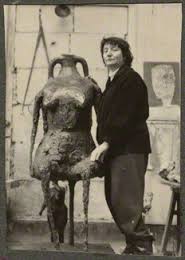 |
| Germaine Richier by Ida Kar 1954 © National Portrait Gallery |
 |
| Le Roi left, La Reine right |
So it is possible that colour is used as decoration on the HRH's visage, as it is on the King's back, as well: where there's a big patch of gangrenous yellow/green - but the décor is much more elaborate on the florid flanks of the Bishop ('hunchback' as Da Costa describes him).
 |
| Le Fou both sides |
Finally there is the Rook, which appears to defeat even Valérie Da Costa. All she can say is that it is humanisée, which must be debatable whatever your point of view - and actually there are three to choose from.
 |
| La Tour from all three sides. |
L'Échiquier (Grand) is an engrossing work that repays time and close inspection, and not - if I may repeat a constant complaint - a snap, a tick, and off to sample the Tate's merchandising. The five pieces are richly, inventively, and distinctly individuated. They each have their specific character and - implausibly - their own particular way of expressing themselves. The more you look, the more - fractal-like - you get drawn in; and the more you speculate about what each one is trying to say. With its lese-majesté the work as a whole could be seen as an anti-establishment lampoon; or perhaps just anti-clerical if, after her run-in with the Church, Richier was getting her own back for their conservatism (though this is not, it has to be said, suggested by Da Costa; and in fact the Christ on the Cross was re-installed in 1971).
However you read Germaine Richier's distorted and deformed, mutated and mutilated figures lost in their post-apocalypse wasteland, they make an utterly compelling piece of chess-in-art - you'll find them in the Tate Modern Boiler House, Level 2: In the Studio.
[For a continuation please go to Miss Tanning's Appendix]
Reference
Valérie Da Costa Germaine Richier: Un Art Entre Deux Mondes Adagp Paris 2006.
Note added 14 September 2016. The Autumn 2016 issue (no. 38) of Tate, Etc magazine has an excellent article on Germaine Richier by Natalie Ferris, in which she discusses L'Échiquier (Grand).
Chess in Art Index at another place
No comments:
Post a Comment